Here are some screenshots from some of the Amplio systems currently active at Memorial Sloan Kettering Cancer Center.

This is a report from the Amplio system for radical prostatectomy. Shown on the X axis is the biochemical recurrence rate at two years; on the Y axis is the rate of functional recovery by two years, that is, the proportion of patients that are both potent and continent. The surgeon who logged in is represented by the red dot and other surgeons are represented by blue dots. The surgeon has the option to select open, laparoscopic, and/or robotic surgery, as well as the risk levels of patients for both outcomes. For BCR-free rates, he or she can select to view results from one year up to five years; for potency and continence rates, the surgeon can choose functionality at a variety of time intervals as well as to see results from surgeon-reported data and/or patient-reported data.


There is widespread agreement that most low-risk prostate cancers do not need to be treated. Surgeons can see what proportion of their patients meet the criteria for low-risk disease and compare this with the rates of their colleagues. From the two graphs, we can see that the rate of surgery for low-risk cancer has decreased from an average of 20 percent from 2012 to 2015 to almost 15 percent in the last year, and that there is less variation between surgeons.

For this graph, the surgeon has the option to choose between complete or optimal debulking, and any combination of all surgeries, upper abdominal resection, and bowel resection. A key finding here is that there is little correlation between debulking and complication rates; in other words, there are differences in technique between surgeons rather than differences simply in trading off more- versus less-aggressive surgery.

Clinicians can choose to view distal or proximal margin lengths, or as in this case, the minimum of the two. There is also the option to filter margin lengths.

This shows the proportion of patients discharged after surgery for stomach cancer. Options on the right allow the surgeon to adjust the discharge time (to show, for example, how many patients were discharged after ten days), and the type of surgery (open or minimally invasive).

The red bar represents this specific surgeon’s incision time for minimally invasive surgery, as compared with the time for other surgeons in blue.

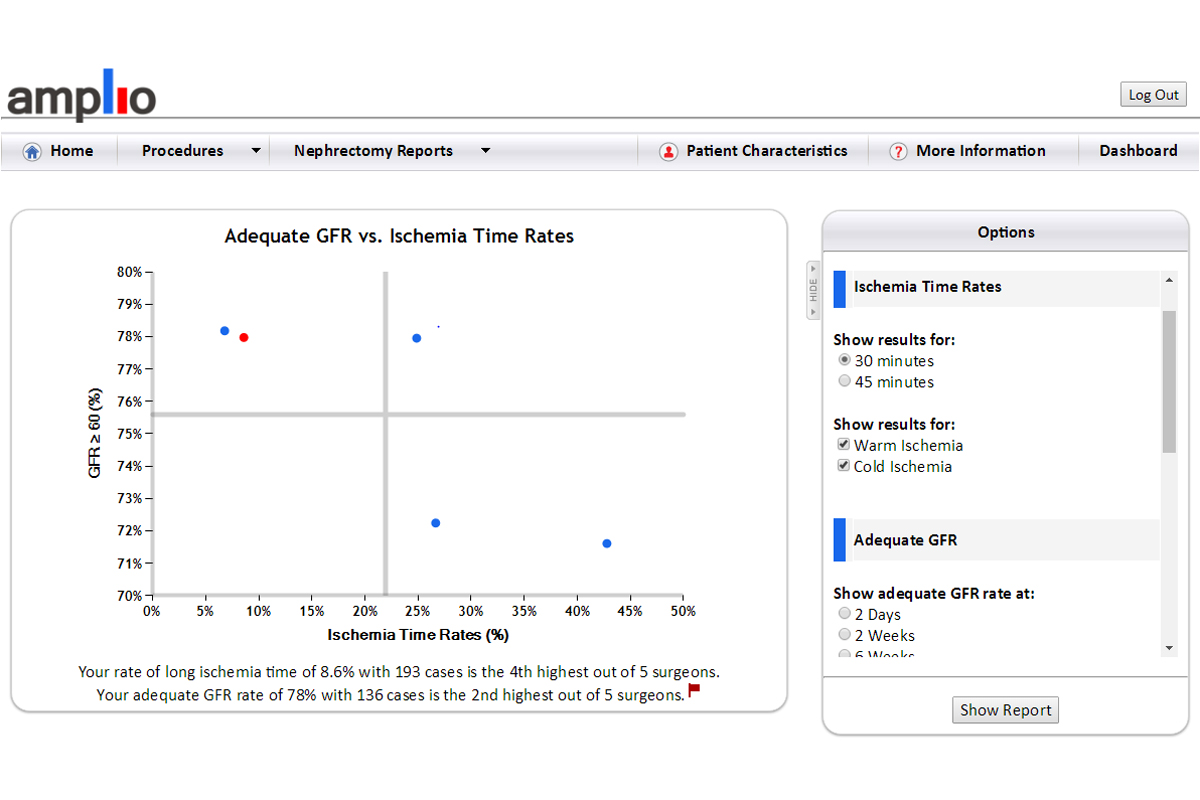
This graph plots adequate kidney function against ischemia time rates. There are many different outcomes a surgeon can explore with these axes by selecting a combination of different options. For both outcomes, the Amplio user can filter by active surgeons, surgery type, and date range. For ischemia rates, the time can be restricted to greater than 30 or 45 minutes, for either warm, cold, or both types of ischemia. Kidney function rates can be graphed from several time periods ranging from two days to one year post operation.